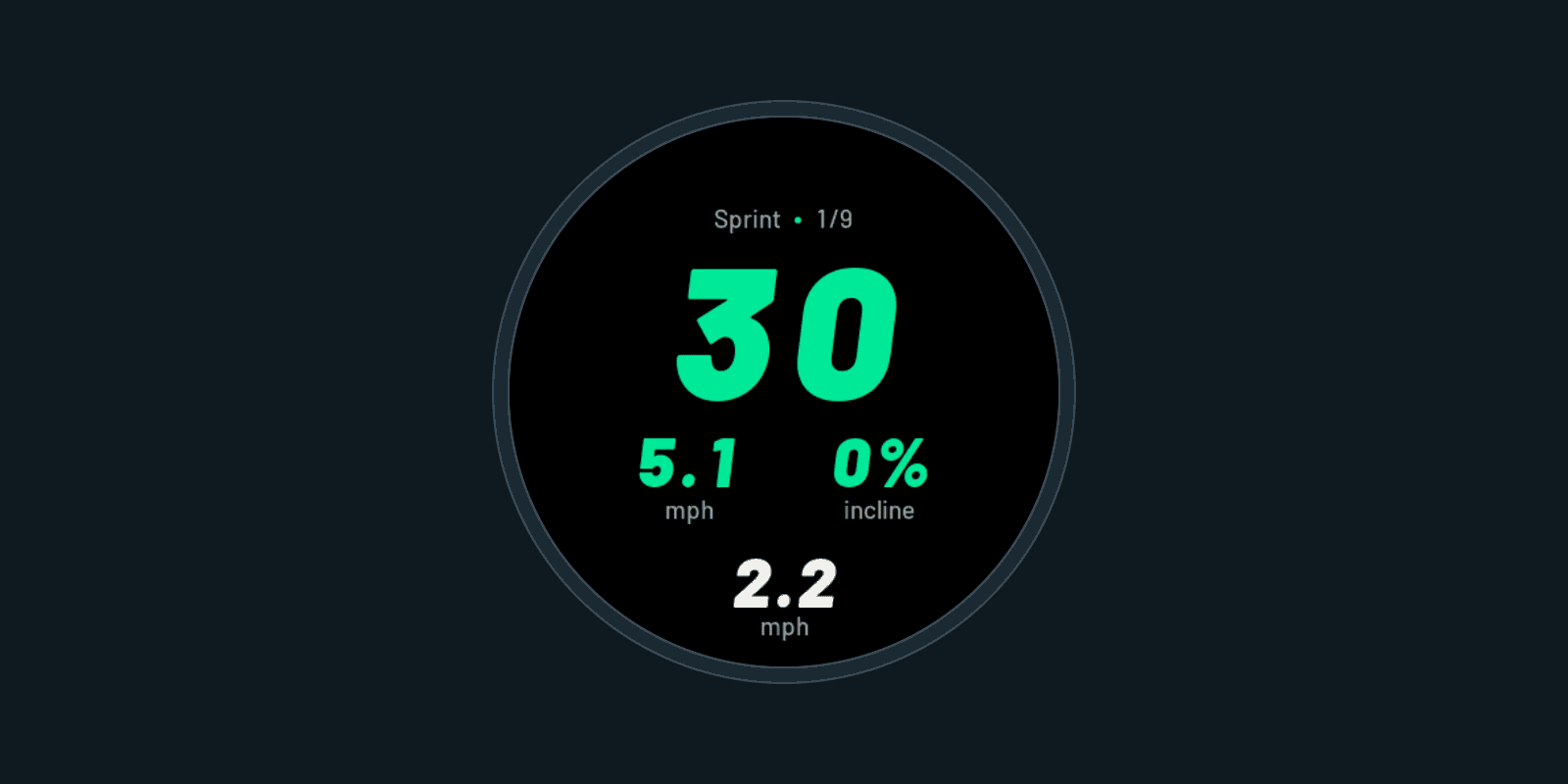
a workout app on a watch is about as human as software gets. it's on your wrist, mid-run, and you get one glance. the belt is moving, you're breathing hard, and whatever is on that screen either makes sense right away or it doesn't. that needs human attention while it's being built, not after. so the part that decides how the app feels stays with me: which screens exist, what's on them, and how a run flows from START to the end.
that turned into one rule in the repo:
Finish static screen designs and obtain owner approval for every screen before implementing the approved set in the app or running simulator validation.
the owner is me. the rule sits in the file every agent in the repo reads, so it applies to anything touching the code. agents can implement. they just can't implement a screen i haven't looked at and said yes to.
how it started
early on i asked for design-only review and approval for every screen first. the review gate is pretty blunt about it: "Do not compile or launch the simulator for individual design iterations."
the reasoning is boring but real. my test watch is an epix Pro, 416 px and round. the design rules say no clipping, no overlap, circular padding, and changing digits must never shift the layout. on a screen that small every pixel decision is a product decision, and i'd rather make those on a picture than in Monkey C.
what the atlas actually is
the atlas is one local html page where every screen lives, with a switch at the top: Garmin or Apple Watch.
the Garmin side is a gallery of approved or reused screens. the renders use the actual bitmap fonts from the native resources, so a number in the atlas takes the same space it will on the watch. one generator checks 25,536 native glyph-box combinations across six display sizes. so it's less "mockup" and more "renderer that happens to not be the watch".
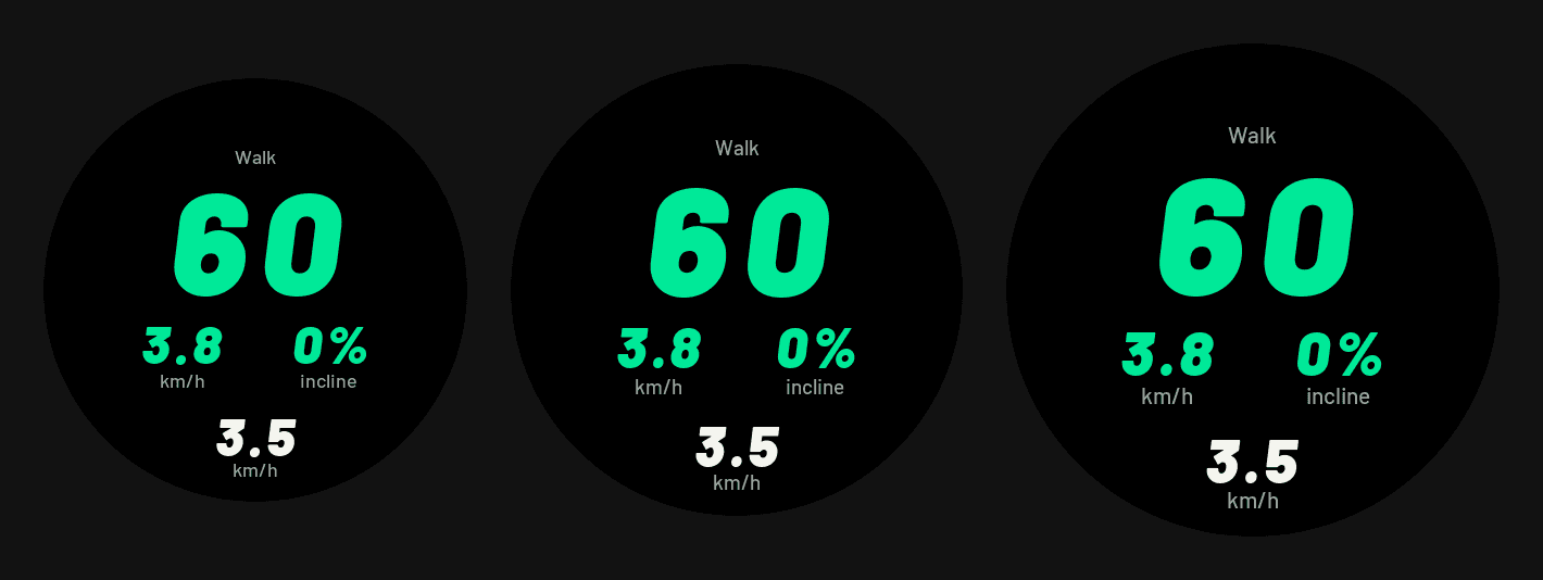
the Apple side is interactive. tap actions, turn the Crown to adjust, swipe right for Controls. it reads no sensors and saves are simulated.
every state, three sizes
on Apple the atlas has 94 states per size, at 40, 46 and 49 mm. close to 300 frames to look at.
the review checklist is what makes the number big: "Review all three sizes, both environments, first/final steps, empty edges, missing/zero readings, every profile field and editor, recovery, save/discard and error states."
a missing reading shows --, but a valid zero stays visible. in the final ten seconds of a phase the ring becomes "Next up" with the actual next movement and duration. if it's not in the atlas, it hasn't been designed.
generating 300 frames is the easy part. deciding which ones should exist at all is the part i don't hand off.
what got caught before any code
this is the part that pays for the whole thing. none of these were bugs. every one was a judgment call, made by looking at the screen, before any native work:
- a treadmill readiness screen before Sprint. full green circle, waits for START so you can get the belt up to speed. it came from my own original brief. i rejected it anyway: one START, then every phase runs automatically. no confirmations mid-run.
- a dedicated "discard failed" screen. i questioned "the need for this rare-failure screen and the growing number of screens versus normal Garmin apps". gone. the failure shows on the screen you were already on.
- a separate outdoor GPS on/off step. withdrawn. GPS is automatic, status lives on the summary.
- an on-watch settings menu. withdrawn, it would duplicate the Garmin/Connect IQ phone settings.
- Fat Loss was effort-led in the brief. in review i removed the effort scale and made time the largest number.
- a Sprint warm-up based on a generic 180-second HIIT example. corrected before any visual was even made.
some calls only came from wearing it. on the watch i dropped the fixed vertical positions: use more upper space, leave at least 7.5% of the display height below. the phase counter on every phase, from the first Walk through the final cooldown, came from the physical watch too.
on Apple it was mostly exploration. three bold workout directions, then my own sketch rendered as a proposal, then three "next up" treatments, then picking "A · Paired readings" with a very formal "I like A implement this one".
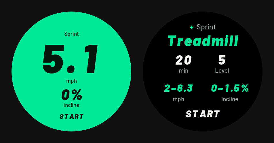
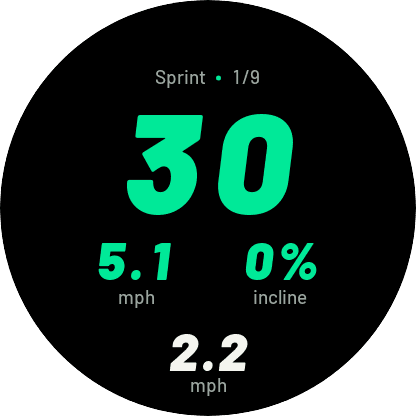
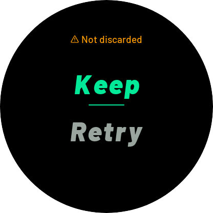
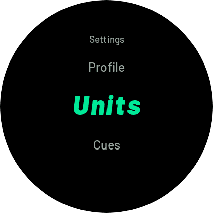
every one of those would otherwise have been code, tests, a build, and then a delete. with two platforms that's Monkey C and SwiftUI, so double. an agent would have happily built all of them. that's kind of the point.
two platforms, one place to look
both platforms live in the same atlas. on Apple setup or coaching you can hit "Compare current Garmin" and see the same plan position next to it. the plan logic is shared too.
what they don't share is approval. Garmin uses physical buttons, Apple uses the Crown and touch, so a Garmin approval says nothing about an Apple screen. Garmin keeps its existing approvals and new Apple screens go through their own gate.
what it costs
it's not free.
- the atlas is its own piece of software, with its own renderer, tests and generators.
- a static screen is not the watch. on Apple the atlas top strip is "illustrative, not a fixed native inset", the real layout uses the runtime safe area. the watch on my wrist still gets the last word.
- approval doesn't stop you changing your mind. i approved a Blade layout for Apple activity selection, then rejected the blades and went with a paged selector. the gate makes changing your mind cheap, not free.
- it's slower. every screen waits for me. i'm the bottleneck, on purpose.
it also keeps states separate: approved, compiled, simulator tested, watch tested, submitted, live. when i signed off the watch sizes ("Looks good.") the approval lists what it does not establish, from native compilation to physical-watch validation. a design approval proves the design. that's it.
would i do it again
yes. on a watch the expensive mistakes aren't bugs, they're screens that shouldn't exist and flows with one step too many. nobody catches those by reading code. you catch them by looking at every screen and then wearing the thing.
so agents write a lot of the code. which screens exist and how a run feels stay my calls.
the revised Apple screens and Health profile access are still waiting for my approval, so the gate is very much still closed on part of this.